Logan Health: Kalispell Regional begins brand transformation
A mock up of the new Logan Health sign that is expected to go up on the west side of Kalispell Regional Medical Center (Photo provided)
Brendan House, North Valley Hospital, Pathways Treatment Center, Glacier View Research Institute, Digestive Health Institute of Montana, Montana Children’s, Eureka Healthcare Specialty Services and The Newman Center.
That’s a condensed list of health-care entities that operate under the Kalispell Regional Healthcare umbrella. But considering the names bear no resemblance to their parent organization, many don’t realize the facilities are all part of one large network.
In total, the Kalispell Regional family consists of more than 40 hospitals, clinics and facilities across the Flathead Valley and elsewhere — a system that has steadily grown since the hospital’s inception in 1910 through a series of acquisitions, mergers, affiliations and expansions.
And now, the Kalispell Regional Healthcare conglomerate soon will rebrand to Logan Health, an identity officials say will better unify the network, eliminate patient confusion and better position the network for future expansion.
“The organization as it is now, is not a branded house, it is a house of brands. And that’s a critical concept that many people miss,” said Cindy Morrison, chief transformation officer for Kalispell Regional Healthcare.
“How can people build a relationship with a brand when they don’t know who’s who, what’s what, and how it all fits together? When you have a house of brands, you have an inconsistent patient experience,” Morrison said, noting the patient experience “is our primary focus.”
Morrison said Kalispell Regional has been immersed in the rebranding process for years, but it wasn’t until late 2020 that a leadership team settled on the name Logan Health.
The brand and logo survived multiple rounds of elimination, eventually becoming the last standing candidate out of a pool of more than 30 names. The team pored over each potential brand, analyzing the name, the font, the color and design of each logo, and more.
“This was an exhaustive process,” Morrison said. “For each of those we had to go over them multiple times to ask whether the elements fit with our vision and our mission and whether it will serve us well into the future.”
MORRISON EXPLAINED that major health-care networks throughout the nation have adopted names that nod to their philanthropic, innovative, geographical and/or historical characteristics.
For example, Intermountain Healthcare was named after its headquarter location, which is situated in the mountainous valley of Salt Lake City, Utah. As another example, Johns Hopkins Hospital, along with Johns Hopkins University, are both named after the legendary investor and philanthropist whose endowments gave rise to the institutions more than a century ago.
As for Logan Health, Morrison said the name is historical, geographical and innovative.
Logan was inspired by Logan Pass in Glacier National Park, which is one of the most iconic destinations in Northwest Montana, sought out by Montanans and tourists alike.
“The park is timeless and it’s permanent, and there will never be another one,” Morrison said. “Millions of people come here every year to see the park and all of its beauty. And the vast majority want to reach its pinnacle, which is Logan Pass. It’s symbolic of an entire area and all it has to offer, and that’s what we wanted to capture.”
Name aside, the team also debated which typeface to use, eventually settling on a serif style, which Morrison describes as clean, classic and recognizable. The typeface was used decades ago on typewriters, and is still one of the most commonly used styles today.
“Everyone, old and young, can look at that and feel a sense of familiarity,” Morrison said.
Leadership also agreed blue and green would be the brand’s primary color palette.
Blue conveys stability, reliability and sincerity, while green conveys energy and nature. Two waves, one of each color, travel across a portion of the word “Logan,” which are also meant to represent the hospital system’s past merging with its future.
“When we were building this brand we knew we wanted it to be simple, memorable and relevant to the industry we are in,” Morrison said. “All of those elements accomplish that.”
WITH THE parent brand established, Morrison said hospital officials now are focused on the entire network. That includes everything from large exterior signs on the main Kalispell campus and elsewhere, to ensuring the name appears on notepads, name tags, on hallways signs and more.
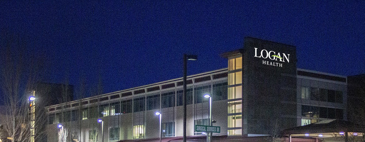
The community may witness some of this transformation as soon as a few weeks from now when the Kalispell Regional signs that are visible from U.S. 93 are replaced with larger ones depicting the Logan Health brand.
Shortly after that, Morrison said the name is expected to go up on the prominent rock wall on the west side of the main hospital building that is visible from the intersection of Sunnyview Lane and Surgical Services Drive.
And at the very top of that structure, above the eventual Logan Health lettering, will be a large blue light that will allow patients and visitors to easily locate the main hospital entrance and emergency department.
“When something happens to your loved one and you’re all of a sudden in your car, speeding to the hospital, you want to know exactly where you are going,” Morrison said. “The blue light will serve as a sort of beacon for people to follow.”
Morrison said these efforts already are underway at all of Kalispell Regional Healthcare’s facilities as a team works with each entity to build its own “sub brand.”
All entities under the umbrella organization — with the exception of North Valley Hospital, which has yet to put a name change to a vote — will soon bear uniform monikers such as Logan Health Primary Care, Logan Health Neuroscience and Logan Health Children’s. That includes the numerous facilities that exist outside of Flathead County, such as Eureka Health and the recently acquired Marias Medical Center in Shelby.
Morrison described the signage switch as “an orchestration” that is expected to unfold simultaneously throughout the entire network over multiple phases. At the main Kalispell campus alone, she said crews are expected to update more than 200 signs in the coming months.
“By the end of summer the shift will be dramatic enough for the community to notice the changes across the entire system,” Morrison said. “We hope by the end of 2021, the aesthetic parts of the rebrand will be complete, but we do acknowledge that is ambitious.”
Hospital officials have declined to provide a price tag for the rebrand, but have maintained the long-term benefits far outweigh the costs associated with the transformation.
Reporter Kianna Gardner can be reached at 758-4407 or kgardner@dailyinterlake.com